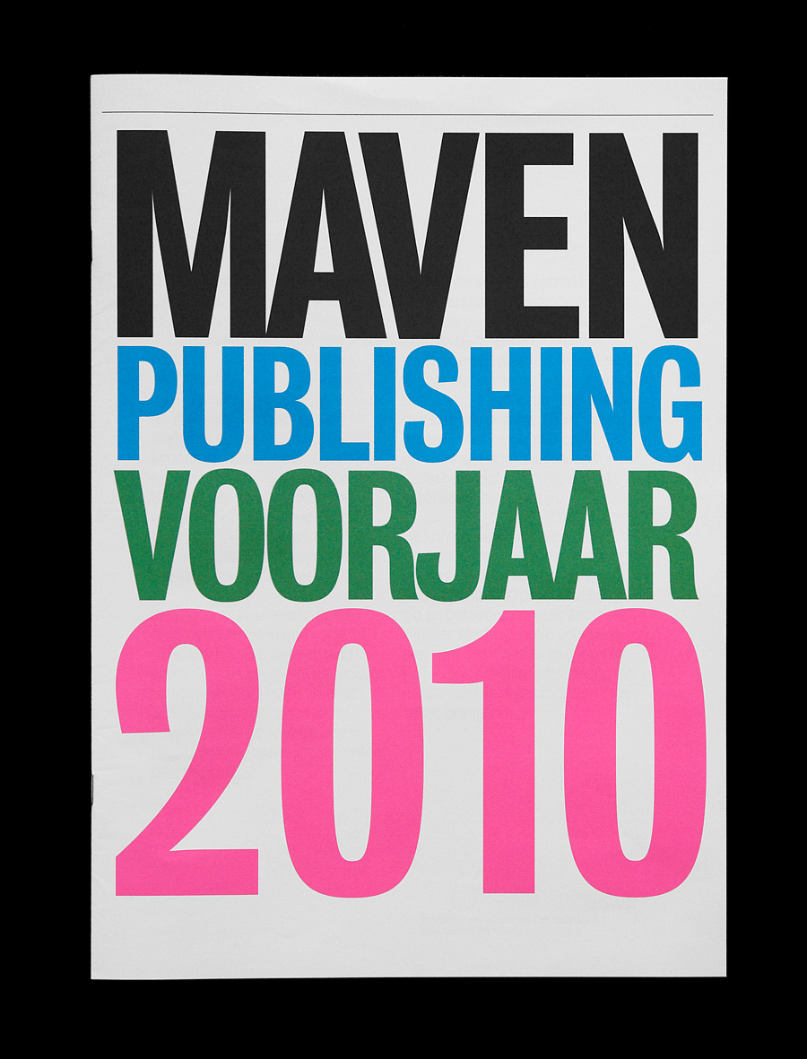
Maven Publishing Spring 2010 Catalogue
Designed at G2K, Amsterdam. 2010. Spring 2010 releases Maven Publishing.
Matt van Leeuwen. Graphic Design. New York City. Currently Head of Design at McCann. Keep. It. Simple.
Designed at G2K, Amsterdam. 2010. Spring 2010 releases Maven Publishing.
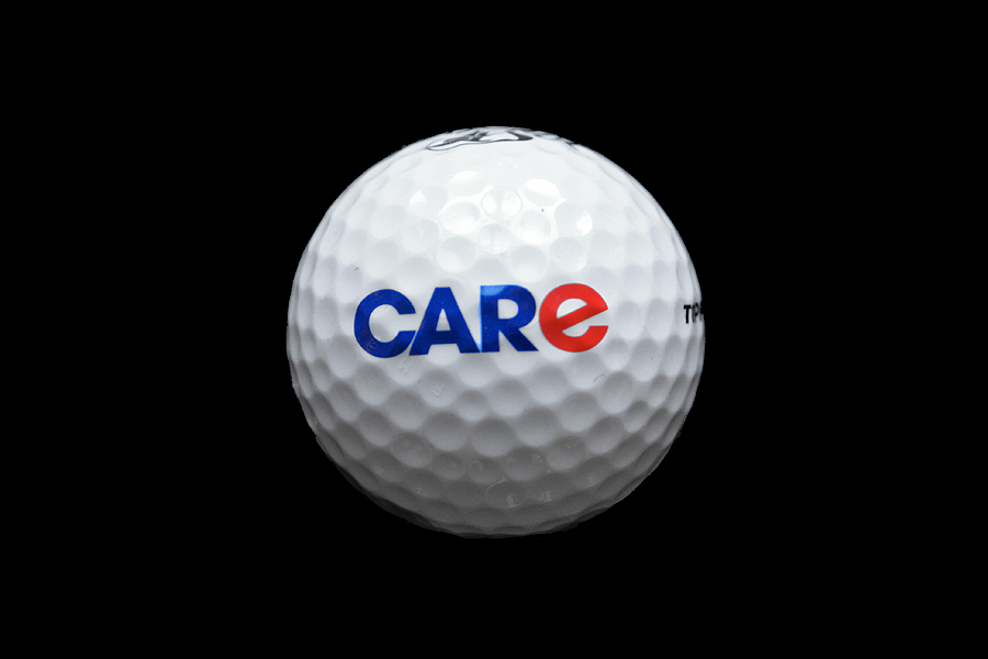
Visual identity at G2K, Amsterdam. 2007/2008. The largest chain of car-repair-shops in Europe. The ‘e’ makes the subtle distinction between car and care.
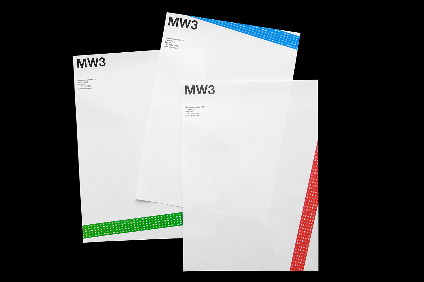
Visual identity at G2K, Amsterdam. 2009. MW3 founded by a ‘wealthy’ collective of men, aims for providing a safe webinterface, when one deals business outside the office. The tickertape which covers all the stationary, repeats MW3.
Visual identity at G2K, Amsterdam. 2008/2009. In collaboration with Laura Hirt. Zwind operates in the public arena; creating local projects for social issues.
Visual Identity at G2K, Amsterdam. 2009.
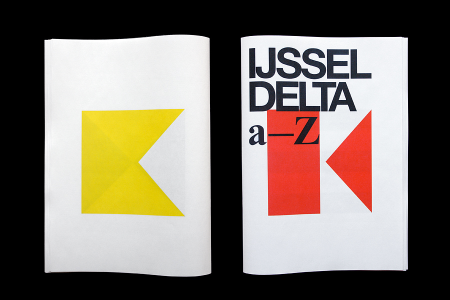
Type design at G2K, Amsterdam. 2008. The underlying graphical alphabet, used for the visual identity of the IJsseldelta. 2 times 26 letters makes 52 pages.
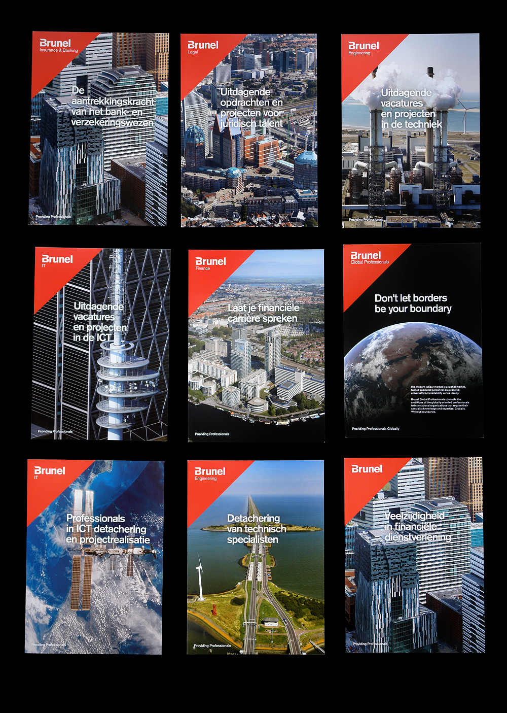
Brochure/Art direction for Brunel (International), at G2K, 2009/2010. With custom aerial photography on the spot, showing locations of operations for Brunel. Photography: Marco van Middelkoop.
Research at G2K, Amsterdam. 2008.
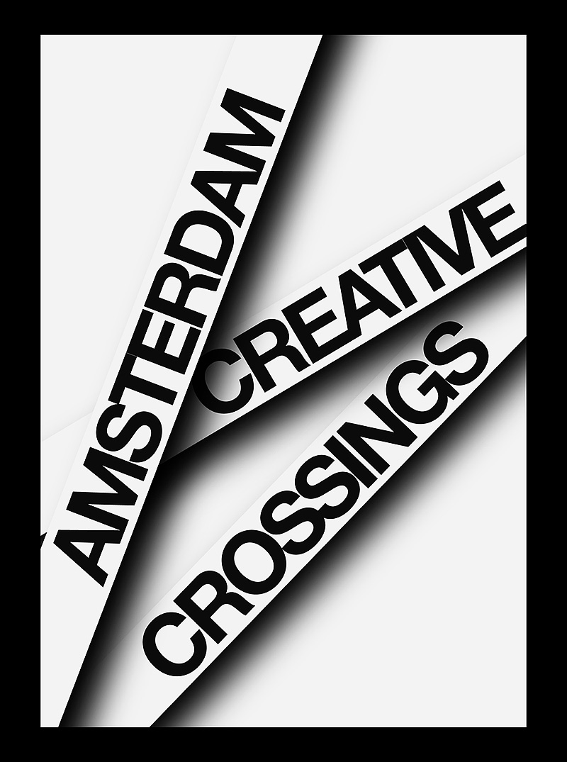
Small visual-research-document on the identity for Amsterdam Creative Crossings: A spiderweb-esque structure in which the ‘logo’ isn’t fixed, but acts as a dynamic interface; symbolizing the intention of ACC: establishing (side)connections between business and culture.
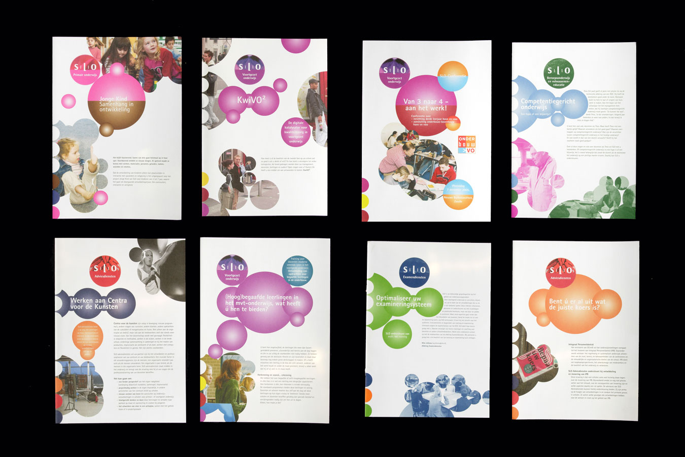
Corporate Identity-Design within an existing framework for the SLO. In collaboration with Gerco Hiddink. 2004-2006.
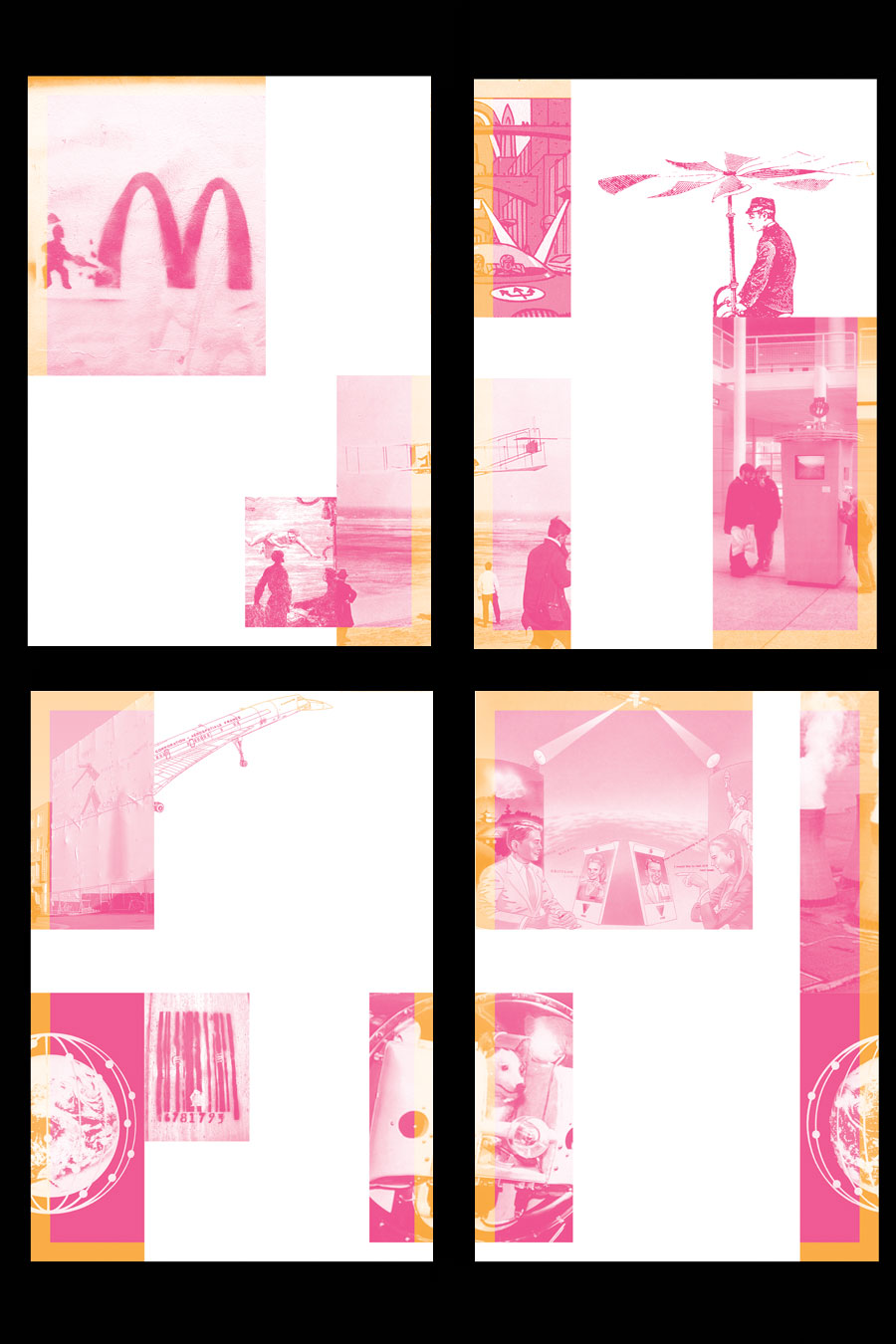
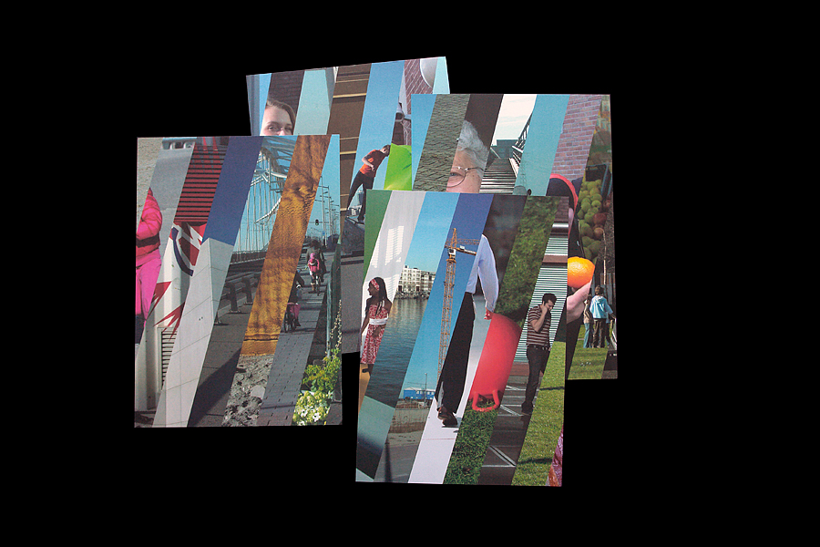
Visual identity, in collaboration with Gerco Hiddink. for ‘CityJam’, a project by Hooghuis, Arnhem, The Netherlands. The identity is formed by a collection of images brought together on an associative base. Some are directly related, others with the blink of an eye. The A2-poster can be printed directly, but is also designed with the possibility to be cut up in four pieces. Each piece (A4) tells a part of the bigger story. These pages can be used as stationary. Maximum effect is created by the use of Neon colors. 2004.