De Vijfde Revolutie / Mindfield

De Vijfde Revolutie / Mindfield

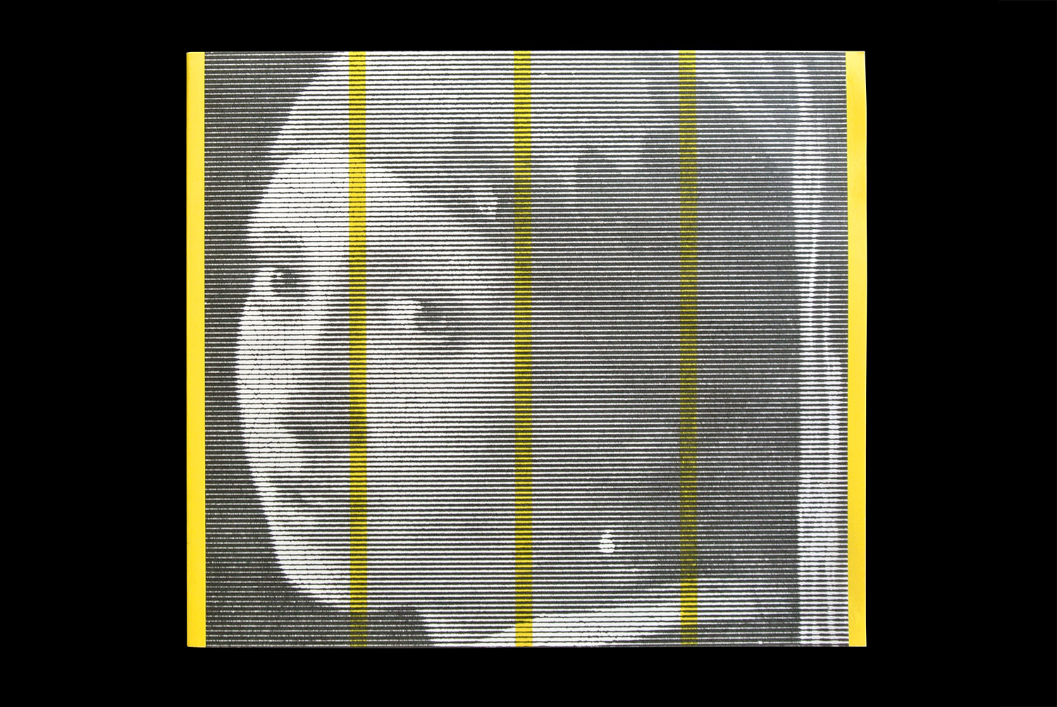
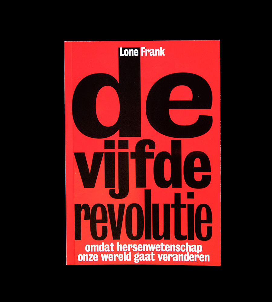
Book design at G2K, Amsterdam. 2010. Part of the Visual Identity for Maven Publishing. The first title of the new publishing house ‘Maven Publishing’. ‘De vijfde Revolutie’ by Lone Frank focusses on the fifth revolution in science: after Copernicus’ universe, Darwins Evolution Theory, Freuds Observation of the human mind and Watson/Crick’s DNA Helix, the new science is that of the brain. All the design-work for Maven has been awarded with a ‘Red Dot Design Award 2010’.
Zwermintelligentie / The Perfect Swarm cover

Zwermintelligentie / The Perfect Swarm

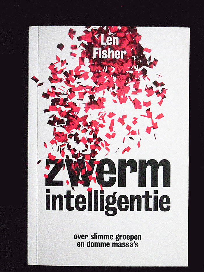
Book design at G2K, Amsterdam. 2010. One of the greatest discoveries of recent times is that the complex patterns we find in life are often produced when all of the individuals in a group follow the same simple rule. This process of “self-organization” reveals itself in the inanimate worlds of crystals and seashells, but as Len Fisher shows, it is also evident in living organisms, from fish to ants to human beings. The coordinated movements of fish in shoals, for example, arise from the simple rule: “Follow the fish in front.” Traffic flow arises from simple rules: “Keep your distance” and “Keep to the right.”

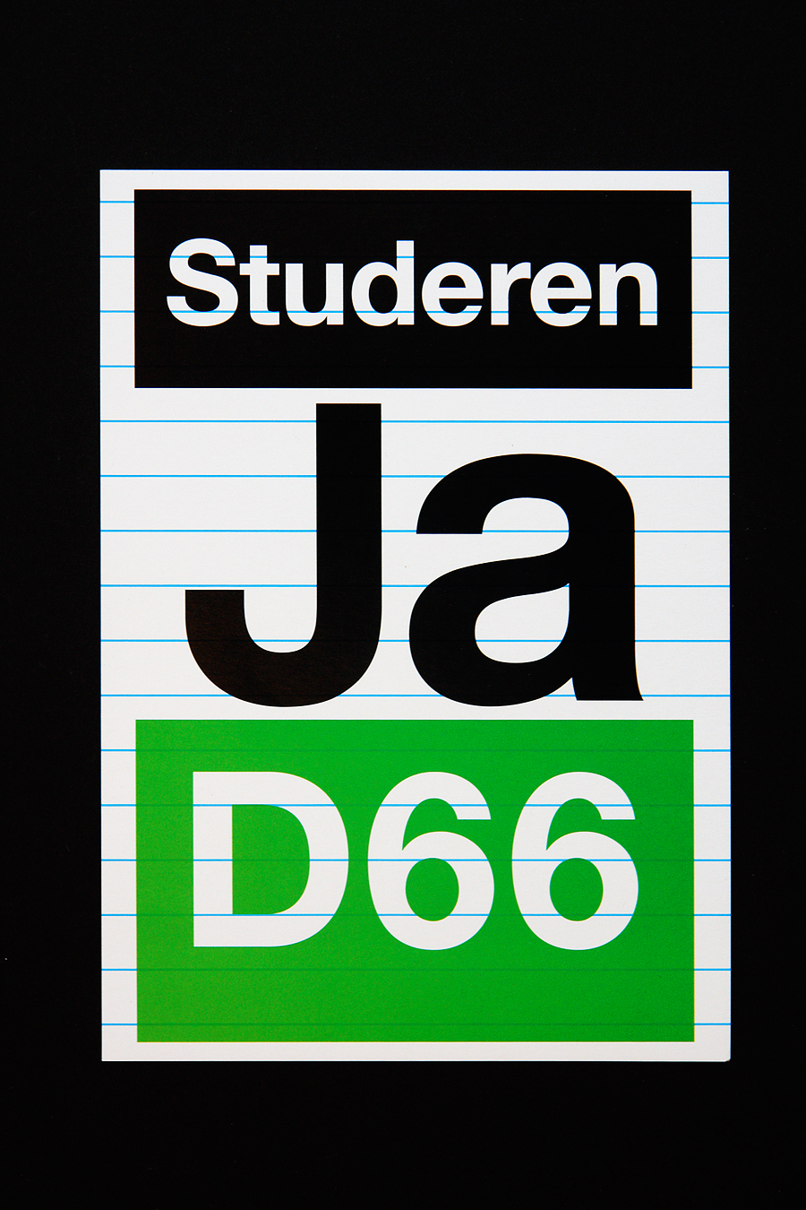
D66 Study Yes!

Poster design for the Dutch Political Party ‘Democrats 66’. A series of political Statements: Nightlife Yes!, Gay Yes!, Study Yes!. 2009.

Matthijs Matt van Leeuwen, IJsseldelta, Identity, G2K Designers Amsterdam, Logo, Typeface

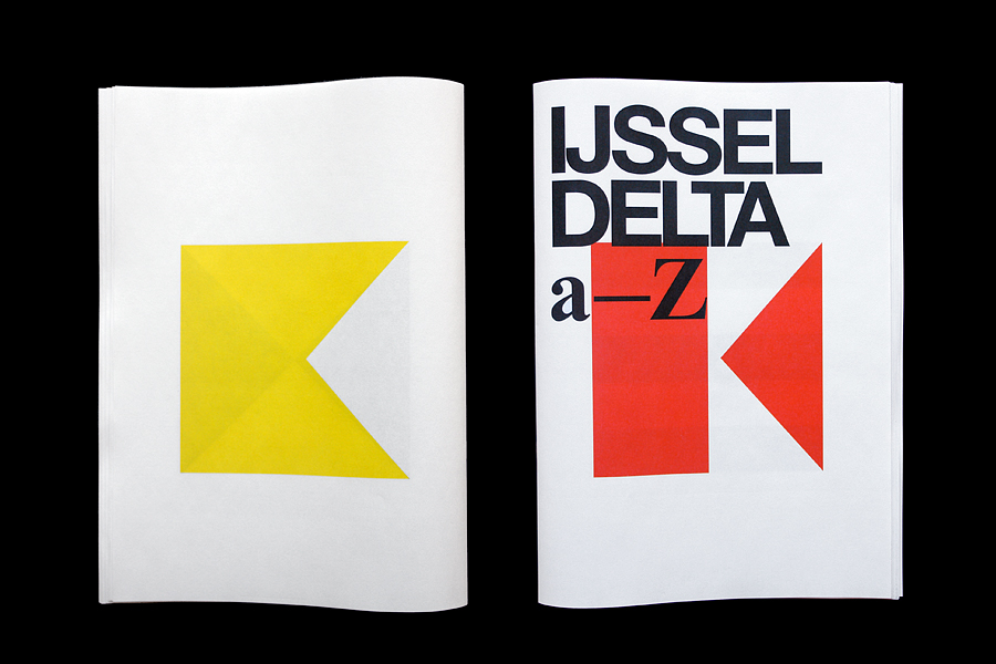
IJsseldelta a-Z

Type design at G2K, Amsterdam. 2008. The underlying graphical alphabet, used for the visual identity of the IJsseldelta. 2 times 26 letters makes 52 pages.

Brunel Brochures

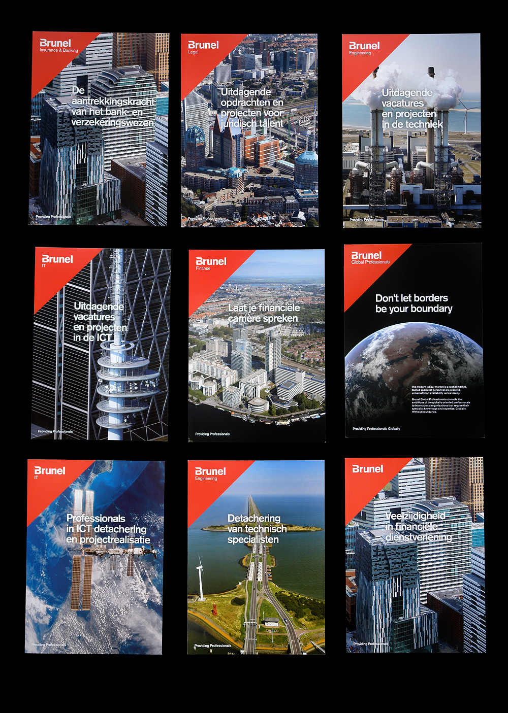
Brunel Brochures

Brochure/Art direction for Brunel (International), at G2K, 2009/2010. With custom aerial photography on the spot, showing locations of operations for Brunel. Photography: Marco van Middelkoop.

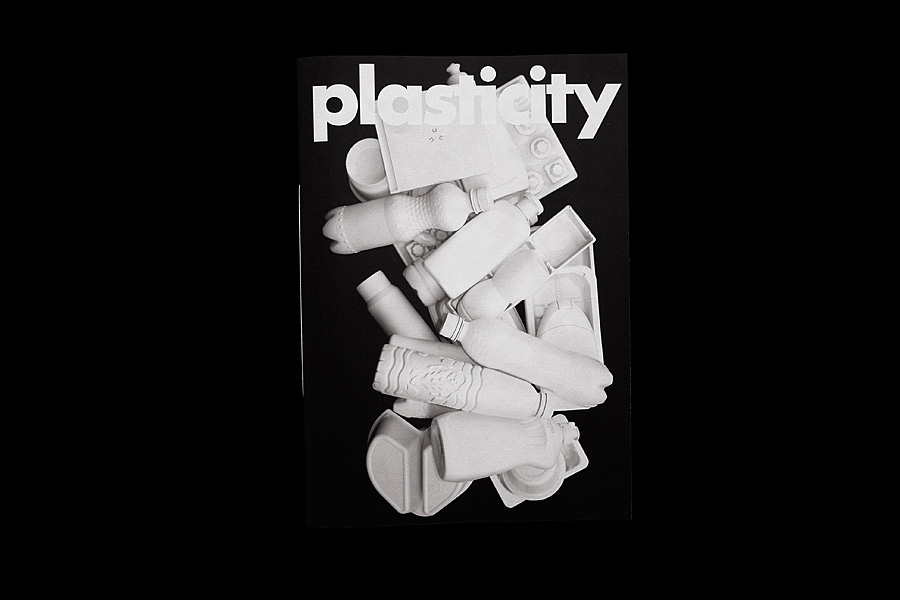
Plasticity

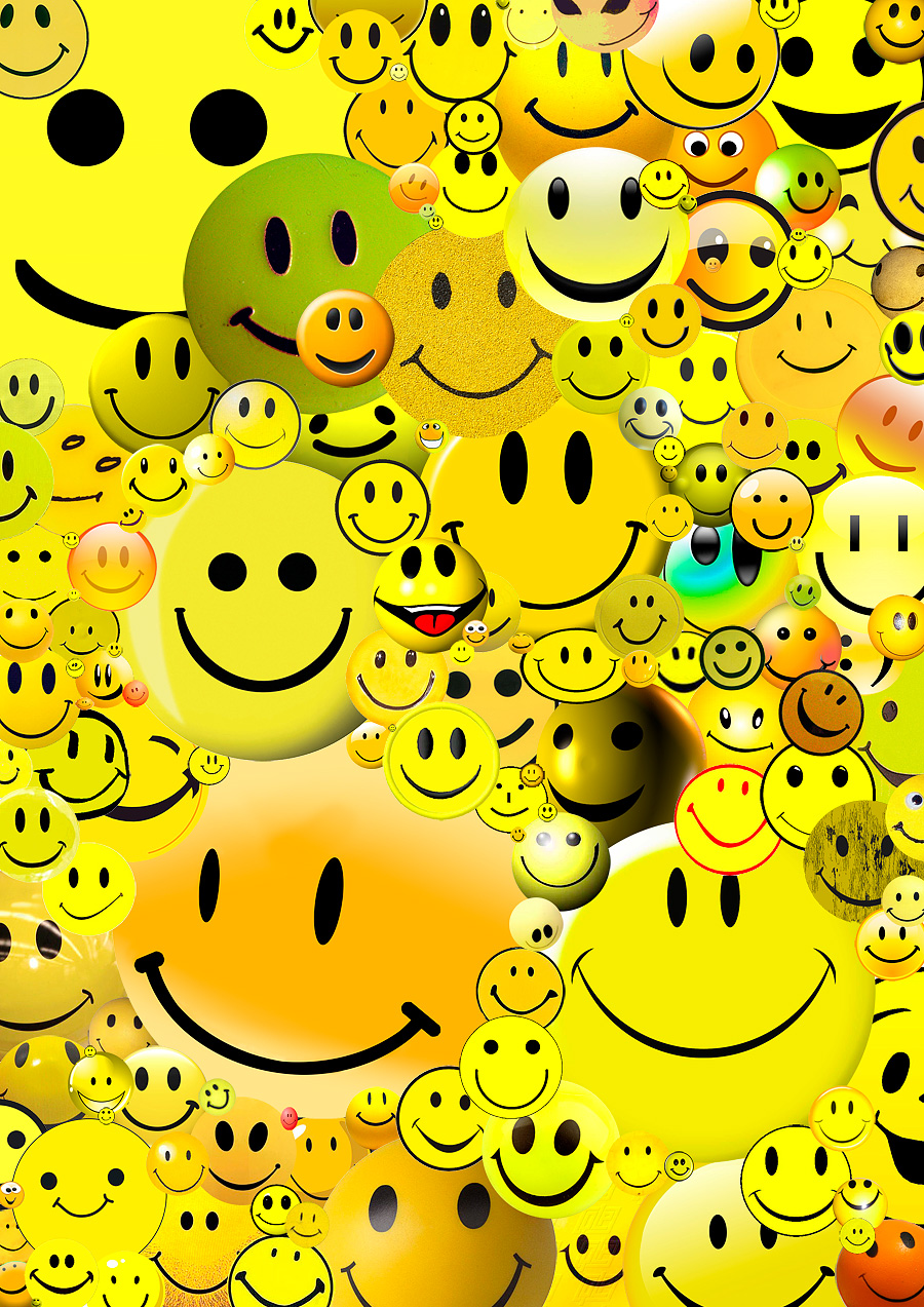
Research. 2009/2010. Detached from habitat and uncovered of their smiling messages, these ‘plastiques’ transform into a anonymous collection of shapes and mass withholding their original purpose; what’s left is a almost ‘typographic’ series of seemingly well-familiar objects. Positive/Diapositive.

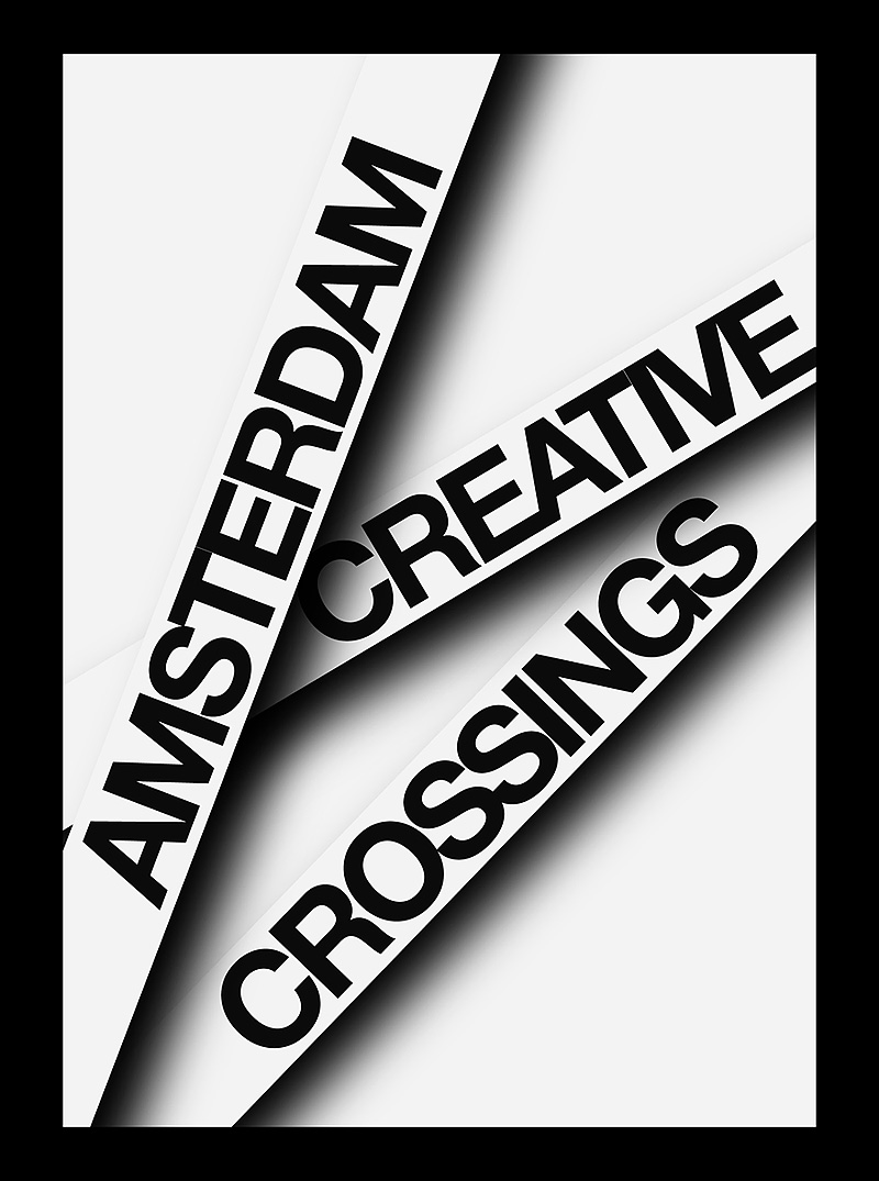
Amsterdam Creative Crossings Research

Research at G2K, Amsterdam. 2008.

Small visual-research-document on the identity for Amsterdam Creative Crossings: A spiderweb-esque structure in which the ‘logo’ isn’t fixed, but acts as a dynamic interface; symbolizing the intention of ACC: establishing (side)connections between business and culture.

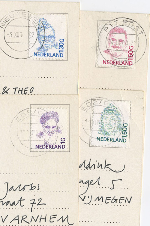
Poststamps

Post stamps, in which the style of the Dutch stamps of Peter Struijcken is used to tell a new story. The portrait of Queen Beatrix is replaced by those of several dubious world leaders. Rebel-leader of the Kurdish Abdullah Öcalan, President Mobutu of Zaire, Yassar Arafat, leader of the Palestinians and Ayatollah Khomeini, spiritual leader of Iran. 2000.

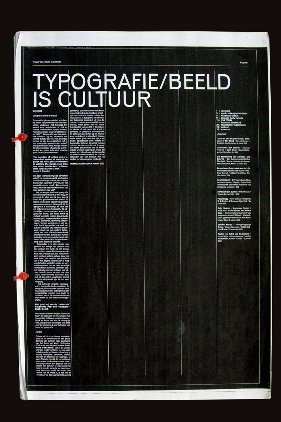
Typography/Image is culture

Term paper Graduation. 2002. Executed on actual newspaper size (DIN A2). The term paper researches cultural/typographical qualities in newspaper design. The newspaper as cultural phenomenon and blueprint of a culture.

Urban Theory

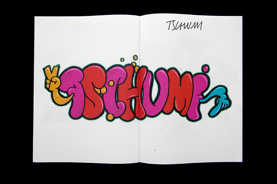
Type design, Graffiti. 2007/2009. Urban graffiti meets Theory on Urbanity and Public Space. First version created during Logo Parc, finished in 2009. The anonymous tags and graffiti are replaced by the names of philosophers, politicians and architects reflecting on Urbanity and Public Space, who in themselves become anonymous and encrypted again. As a contrast to street vs. theory. Alain Badiou, Chantal Mouffe, Bernard Tschumi, André le Nôtre, Francois Mitterrand etc.

Matthijs Matt van Leeuwen, Floor van Essen, HkA, Artez Arnhem, 10 Jaar De Kunsten

De Kunsten

Book/Magazine design, In collaboration with Floor van Essen. 2001. Indexnumber ‘Tien Jaar de Kunsten’, magazine of the HkA (now Artez).